Dark, Moody Color Palette: How Warm and Cool Tones Change the Ambiance
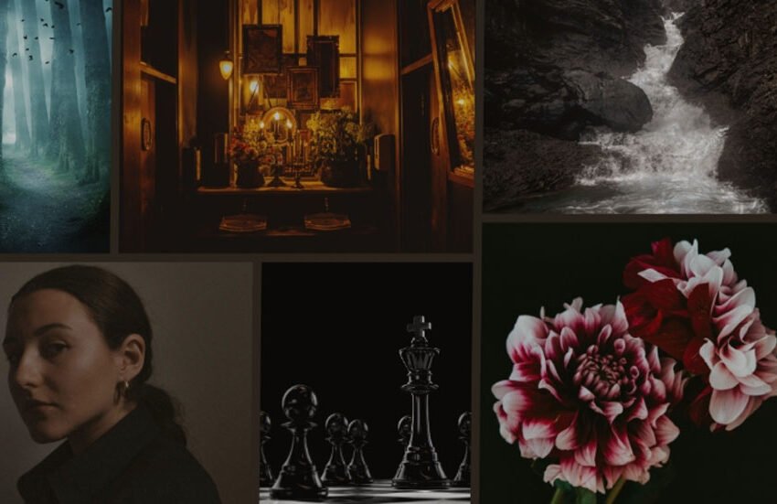
Dark moody color palettes are totally taking over right now, especially in creative spaces. Whether it’s in art, photography, or interior design, these dark tones are everywhere. For 2024, Pinterest’s big trend is “Western Gothic,” a vibe that mixes vintage styles with deep, dark colors. It’s all about that mysterious, edgy feel. This only shows the constant rise of interest toward more dramatic tones and choosing deeper and bolder ambiance.
The popularity of a dark moody color palette thrives on rich deep shades such as charcoal gray, navy, or burgundy, efficiently adding striking, intimate, and trendy appeal. However, you should know the two tones that make a huge difference in your design: warm and cool.
Warm tones center on gold, deep red, and burnt oranges. These colors give off dynamic energy, which makes the ambiance more inviting, cozy, and bright. On the other hand, cool tones include emerald greens, muted grays, and deep blues. These hues turn your spaces into a peaceful yet mysterious feel, making them calm and precious. Despite the disparity, you should remember that the balance of warm and cool tones remains vital.
However, black is always the center of any dark-mode color scheme. It grounds the image to give it elegance and versatility. Combined with white, it creates considerable contrasts, and many ask, “What mood does black and white create?” The answer often lies in their capacity to generate timelessness and contrast, ideal for designing bold, emotional atmospheres.
What Is a Dark, Moody Color Palette?
Ever wonder how to make your space or artwork feel bold and dramatic? Dark, moody color palettes hold the secret sauce! This style of deep, rich shades, from charcoal gray to navy blue, forest green, and dark plum, creates a mysterious vibe that is sophisticated, clean, and standout. It’s just about adding that extra punch to your design, which makes everything feel a little more intense and intriguing.
These dark tones give drama in how they occupy a space or visual. The black color mood adds some depth through refined lighting and shadows. The dark mode color palette gives a richness that is impactful and sets the right mood for designing rooms, digital pieces, or even snapping photos.
Warm vs. Cool Tones in Dark, Moody Palettes

Using a dark mode color palette requires both warm and cool tones to get into your desired atmosphere. Each creates a feel, and when combined, they can intensify the richness and nuance of your design.
Here’s what distinguishes the two from each other:
Warm Tones
- Its colors include deep reds, burnt oranges, and golden yellows, which are very intense and energizing.
- These tones exude passion, excitement, and comfort.
- They give a warm and rich sense to a space or an artwork, making everything comforting and lively.
- When the color mood is black, pairing with warm tones creates dramatic contrast and brings the black shades lively.
- For example, a deep red on a black color palette looks so powerful and expensive, whereas a hint of gold gives an elegant sophisticated flavor to it. All of this, put together, creates some sort of energetic, fiery atmosphere and depth in your design.
Cool Tones
- Cool tones include colors like navy blue, emerald green, and violet.
- These hues help create a soothing ambiance and peaceful atmosphere since the dark mode color scheme evokes feelings of tranquility, mystery, and relaxation.
- These tones soften the intensity of dark colors and balance the overall layout.
- For instance, muted green with black creates an intricate earthy, and grounded feel, while dark blues add a sleek, cool elegance.
- The entire appearance of cool designs is high-end and welcoming, so the combination with the black color mood is ideal for more peaceful and introspective designs.
Warm Tones in Dark, Moody Palettes

Warm tones of a dark moody color palette are all about intensity, vibrancy, passion, and a touch of life to otherwise sullen compositions. They typically balance the deep side and cool areas in moody designs. These shades don’t simply brighten a space up but make it feel alive, bold, and pleasant.
Examples
- The mixture of crimson with black, and dusky orange with gray, for example, may suggest luxury and drama: it could be in web design, interior design, or even in branding.
- For instance, a modern sleek bedroom with dark navy walls and mustard accents is sophisticated yet cozy.
- Another example is a website design that highlights key features using rich burgundy and charcoal while maintaining a bold, elegant aesthetic.
- In interior décor, deep maroon curtains and gold light fixtures can give a living room a feeling of luxury and invitation.
- Also, a darker, moodier tone can be applied in wedding designs; it can include dark burgundy, deep purple, and even gold accents for a dramatic and timeless ambiance.
Impact and Tools
- Warm tones, when infused in a moody, dark color palette, add vibrancy and passion to compositions.
- When employed mindfully, they can efficiently give the space or visual artwork a unique flavor.
- To refine this impact, the remove background tool comes in handy, as it lets you separate the warm elements and have them stand out against the dark backgrounds without cluttering.
- This technique enhances the emotional impact of the colors, with warm tones appearing even more powerful.
Cool Tones in Dark, Moody Palettes
Cool tones in a moody dark color palette help create the disposition, making p rojects look more elegant in some cases. Such tones often make designs appear calmer and can draw an audience’s attention. These can balance out the more intense warm tones, causing the other elements to take center stage. Cool tones can also work as the background and the focus of a composition, which can set a tranquil mood that is not overpowering to the viewer.
Examples:
- Visuals: The wellness app, Calm, uses cool tones like deep blues and muted greens to dominate its imagery to instill serenity and mindfulness for its users.
- Graphic Design: The Apple website mainly features a dark mode color palette with some cool tones, over product images. The use of cool tones brings out elegance and sophistication without making the viewer distracted from the sleek design.
- Interior Design: Benjamin Moore’s Dark Glamour uses rich cool tones like deep blues and muted greens to beautifully create serene yet luxurious spaces. This can be seen in modern living rooms when a dark moody color palette creates a sense of inviting atmosphere.
Tips on working with cool tones:
- Use a background remover tool to separate cool-toned elements from the darker background, so that they pop against the background. This helps create sharp contrasts and enhances the calm effect of the design.
- Experiment with gradients by combining cool tones with lighter shades, ensuring smooth transitions and maintaining the overall mood.
- Ensure that the contrast of colors is perfect, as they can fine-tune the subtlety of cool tone without clashing with other elements.
Applications Across Creative Fields
a. Photography
In photography, you have to strategically execute how you can leverage warm and cole tones in your dark moody color palette. Here are some techniques you can explore:
- Warm Tones: Play with your light source and shadows. Try incorporating deep red or feisty oranges to highlight your subject. This will create depth and highlight the contours of a face or make the elements stand out against a dark background.
- Cool Tones: You may use cool tones such as blues and greens in your shadows or backgrounds to introduce space in your composition. With landscapes, use natural cool elements of sky or water to create serenity and peacefulness, thereby bringing an air of warmth in relatively dark areas.
- Combination: Utilize color contrast to balance between the two. For example, a warm-toned light should be on the subject and the background should be in cooler tones. That way, the viewer will get attracted to the subject and create the illusion of depth and dynamic contrast without overwhelming it.
How a White Background Can Enhance Focal Points

- Contrast creation: A white background, compared to darker tones, captures the viewer’s eye on the subject in contrary to details and sharpness. It is mainly perfect for portrait or product photography, which requires less complexity.
- Establishing mood: Applying a white background gives clarity, where dark tones will not dominate the scene, hence allowing for clean, professional, and impactful images.
b. Graphic Design

- Using dark, moody palettes to create visually compelling designs.
Dark moody color palettes capture eyes immediately and evoke intense emotion. Dark tones in your graphic design contrasting against accent colors such as gold or rich reds tend to add dynamic energy and interesting appeal. That is why designers usually find dark modes for dramatic visuals or an edgy aesthetic in tech branding, professional presentation slides, social media posts, or even music album covers. Like what creatives believe, a black color palette always hints at mystery or sets the ground for high-impact visuals for any audience.
- Incorporating warm and cool tones for brand identity or product visuals.
The use of warm and cool tones in design may help define the mood that goes with your brand or product. A design can balance warm tones, which would include deep oranges and reds, and cooler shades, such as muted purples and teals. For example, the majority of a technology-related product might go for cool tones, but it also uses warm tones in the icon or accents to energize the product. These color choices define the aesthetic and enhance your user’s emotional connection to the design. So, balance and the right combination are your keys!
c. Visual Content Creation

Dark backgrounds, like deep blues or blacks, are used with lighter text or vibrant accents to make the content pop. The “black color mood” can convey elegance, mystery, or professionalism. This palette is perfect for digital platforms or apps because it reduces eye strain and creates a more immersive atmosphere when used effectively.
Here are some tips for optimizing online visuals using contrast and mood:
Contrast is Essential: Sufficient contrast between the text and the background aids readability. Bright colors against dark tones enhance emphasis and bring focal points to needed areas.
Establish Mood: A dark moody color palette can achieve different moods. Soft purples and blues are good at calming and serene, and energetic reds or golds create an impression of elegance and intensity.
Accents: Neon or metallic color highlights add a touch of depth to some elements, creating an interesting visual effect and thus making the content more engaging for viewers.
Conclusion
In the world of design, the dark moody color palette makes every space or image revolutionary. Balancing out warm reds, oranges, and golds with cool blues and greens in designs can create visuals that exude both passion and a place to calm down. The warmth injected with vibrancy and energy in designs and a feel of sophistication and peacefulness from cool tones make a difference that helps you stand out amidst the sea of artistry today.
We hope this post efficiently answered “What mood does black and white create” and emphasized that a dark-mode color palette allows other colors to whisper rather than scream.
To maximize its effect, you can always seek assistance from background tools to refine how these colors interplay. In the end, you have the power to turn every color into power and leverage different techniques to pull off the design you envision. The black color mood is only one of the best ways to change the ambiance of your art, and using a dark moody color palette is just an approach you can bank on to bring out the perfect balance of colors and moods you want to bring out.
After all, your hands can shape the mood of a space, and your vision can turn the simplest dark hues into a masterpiece of depth and emotion.